Before you get overwhelmed, take note that these indicators/oscillators were actually derived from previous price movements with some mathematical formulas and won't make any movement unless there is trading happening.
In short they won't tell you exactly what market price comes next on a trading day but just dependent on where the market is heading but just use it to get an edge and serves as either your signal to buy or sell.
Prices will still be decided by people involved in the market which includes the retail traders, institutions plus the different Directors and members of a company who have possessions of number of shares.
Just remember this always, anyone who has volume of shares or amount of money can anytime make the price fluctuates regardless of pumping the price up or dumping his/her shares.
WHAT ARE THEY USED FOR?
Indicators are used as reference for every trader if a certain stock has momentum, or have reached the thresholds where every trader awaits to make their own position (overbought/oversold levels), or a guide where probable "Support and Resistance" may occur and so on.
You are not forced to make use of these indicators in your chart but if you believe it will help you in your trades then it's up to you. If you have the time to back test each indicator and see what suits you best then that would be your own prerogative.
Too much clutter in your chart will only cloud your decisions to execute an order, so it's best to make it simple. I won't go into details how are these indicators computed as you may find lots of explanation from Investopedia and other trading related sites if you need more info.
Let me just run over some indicators and give you sample applications for you to decide later if you will add them up to your charts.
Mostly used Indicators in the Market
Moving Averages
➤we make use of a 50-day moving average (MA50).
➤sample chart below when you look closely on encircled areas and where our MA50 is located with relation to the price.
➤once it stays above your prices you can see the market price on a downward trend, whereas, when it starts to stay below your prices the market reacts and tend to be on an upward trend.
➤notice the shadow (wick) that touches the MA50 and was pushed later and rallied upwards before it started to consolidate and broke the MA50
➤so for most traders who are into short term they only enter the market once prices started to bounce above MA50, and if it broke that level they started to dispose and close their positions.
 |
| chart_from_investagrams_MA50 |
Fibonacci
➤an old one used by most traders would be the fibo to check out possible pullbacks(support) and possible target price areas (resistance).
➤you set up fibo by swinging from Left to Right (e.g. below chart from High to Low) to check for resistance levels.
➤some experienced traders point out to watch out on 3 levels (0.382, 0.50, 0.618) from the fibo (shaded in blue).
➤as you can see 3 resistance levels already broken and a support level along 0.50 seems to be holding while trying to break the 4th resistance.
➤for the second chart below same concept swing from Left to Right this time from Low to High to get possible pullbacks if it fails at the current market price.
 |
| chart_from_investagrams_fibonacci_target_price_(resistance) |
 |
| chart_from_investagrams_fibonacci_pullback_(support) |
Relative Strength Index (RSI)
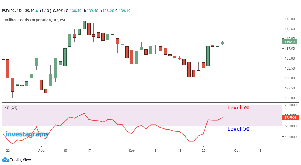
➤the default levels would be at 30 and 70 level, it's like saying when price hits the 30 level some traders will test the waters and buy in tranches, whereas, on the 70th level will be their signal to dispose and close positions, if it goes beyond then watch out until the 75-80th.
➤sample chart below I modified to 50 and 70 level which simply shows that above 50 level, prices tends to move up and below the 50 marking results to prices going down.
➤sample chart below I modified to 50 and 70 level which simply shows that above 50 level, prices tends to move up and below the 50 marking results to prices going down.
 |
| chart_from_investagrams_RSI |
Bollinger Bands
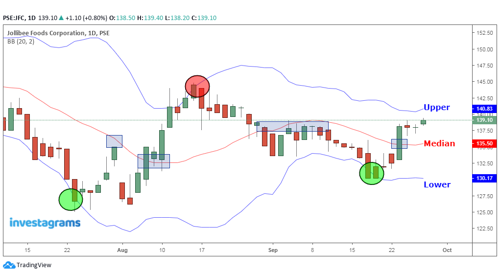
➤default median is at 20-day moving average with an upper band and lower band
➤think of the median like that of a 50-day moving average and you should apply the same concept if it goes below or above the prices.
➤good thing is you are given with an upper band which you can use as your resistance levels, and the lower band as your support levels.
➤think of the median like that of a 50-day moving average and you should apply the same concept if it goes below or above the prices.
➤good thing is you are given with an upper band which you can use as your resistance levels, and the lower band as your support levels.
 |
| chart_from_investagrams_bollinger |
Now it's your turn to explore other indicators from your chart and check which one you think may give you an edge from other traders in the market.
As always reminded by most traders, TAYOR!


0 Comments